How to Left Align Long Button Text in Elementor
If you use Elementor often, you probably will not notice this at first because most button text is short. A typical CTA like “Learn More” or “Get Started” looks perfectly fine when it is centered.
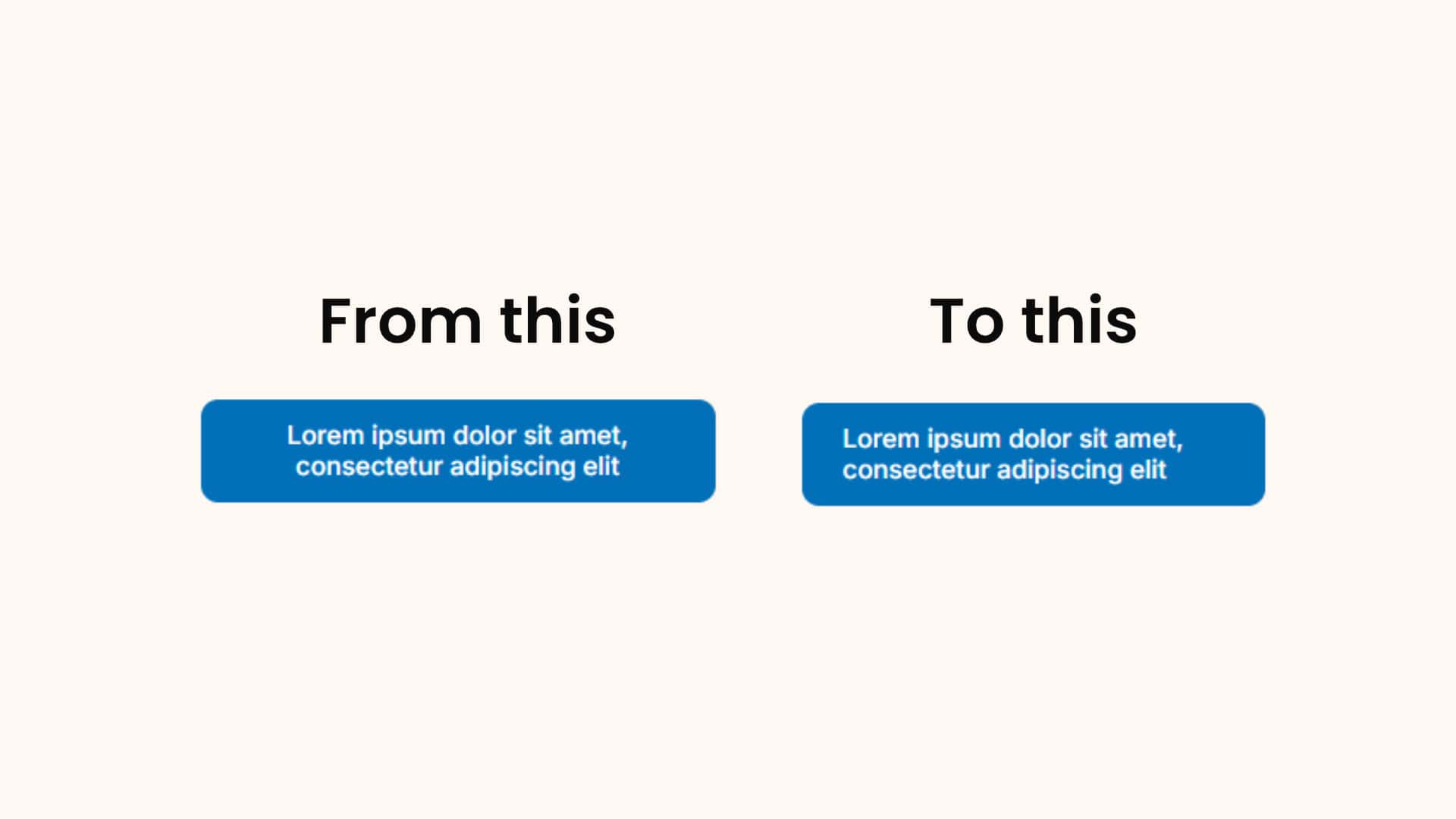
The issue usually shows up only when your button text is longer and the button sits inside a smaller container. Once the text wraps onto a second line, Elementor’s default centered alignment can start to look awkward.
I came across this while working on a layout where the button text needed two lines. Since Elementor centers button text by default, the wrapped text did not look as neat as I wanted. After testing a few things, I found that a small CSS fix was the easiest way to left align it.
When this issue happens
In most cases, you will not run into this problem because CTA buttons are usually short.
But you may notice it when:
- your button text is longer than usual
- the button is placed inside a narrow column or small container
- the text wraps onto the next line
- you want the button text to look cleaner and easier to read
When that happens, the default centered text can feel slightly off, especially if the rest of your content is left aligned.
Example:
Why the default setting looks fine most of the time
Elementor centers button text by default, and for one-line CTA text, that is usually not a problem. In fact, it often looks completely normal.
That is why this issue is easy to miss. You only really notice it when the text breaks into two lines. Once that happens, the centered layout can make the button feel less tidy than the rest of the page.
The simple fix I used
If you are using Elementor Pro, open the Button widget, go to the Advanced tab, and add this in Custom CSS:
					selector .elementor-button-text {
    text-align: left;
    display: block;
}
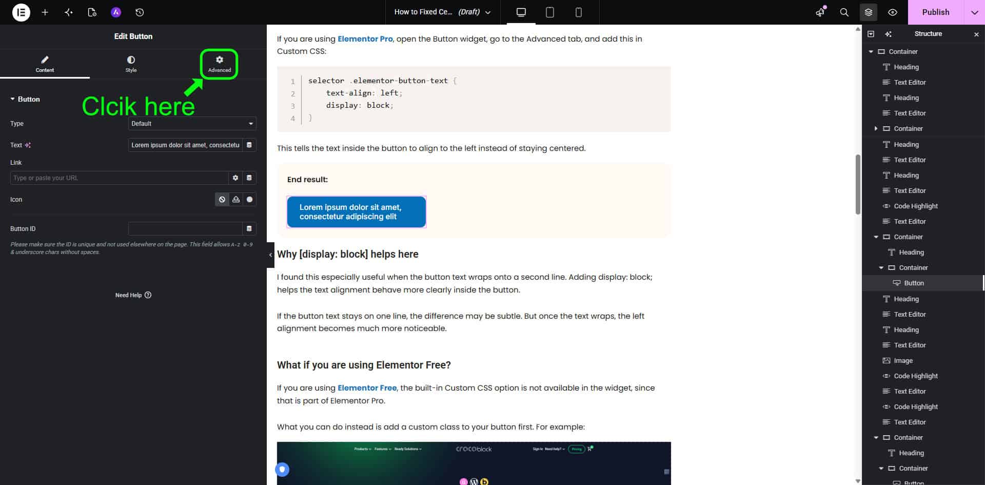
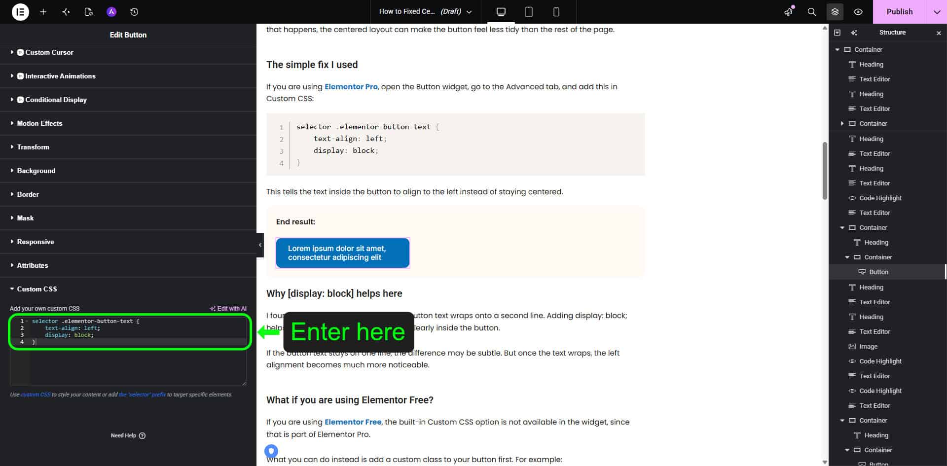
This tells the text inside the button to align to the left instead of staying centered.
Why [display: block] helps here
I found this especially useful when the button text wraps onto a second line. Adding display: block; helps the text alignment behave more clearly inside the button.
If the button text stays on one line, the difference may be subtle. But once the text wraps, the left alignment becomes much more noticeable.
What if you are using Elementor Free?
If you are using Elementor Free, the built-in Custom CSS option is not available in the widget, since that is part of Elementor Pro.
What you can do instead is add a custom class to your button first. For example:
left-align-button
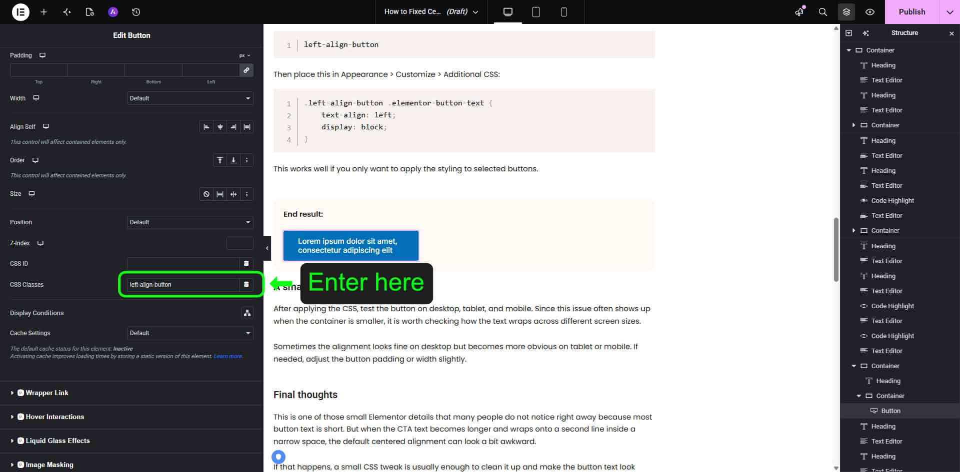
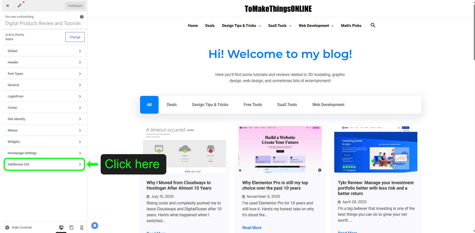
Then place this in Appearance > Customize > Additional CSS:
					.left-align-button .elementor-button-text {
    text-align: left;
    display: block;
}
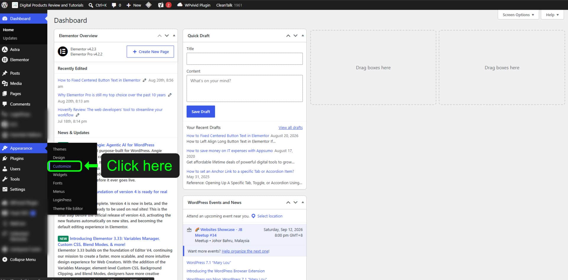
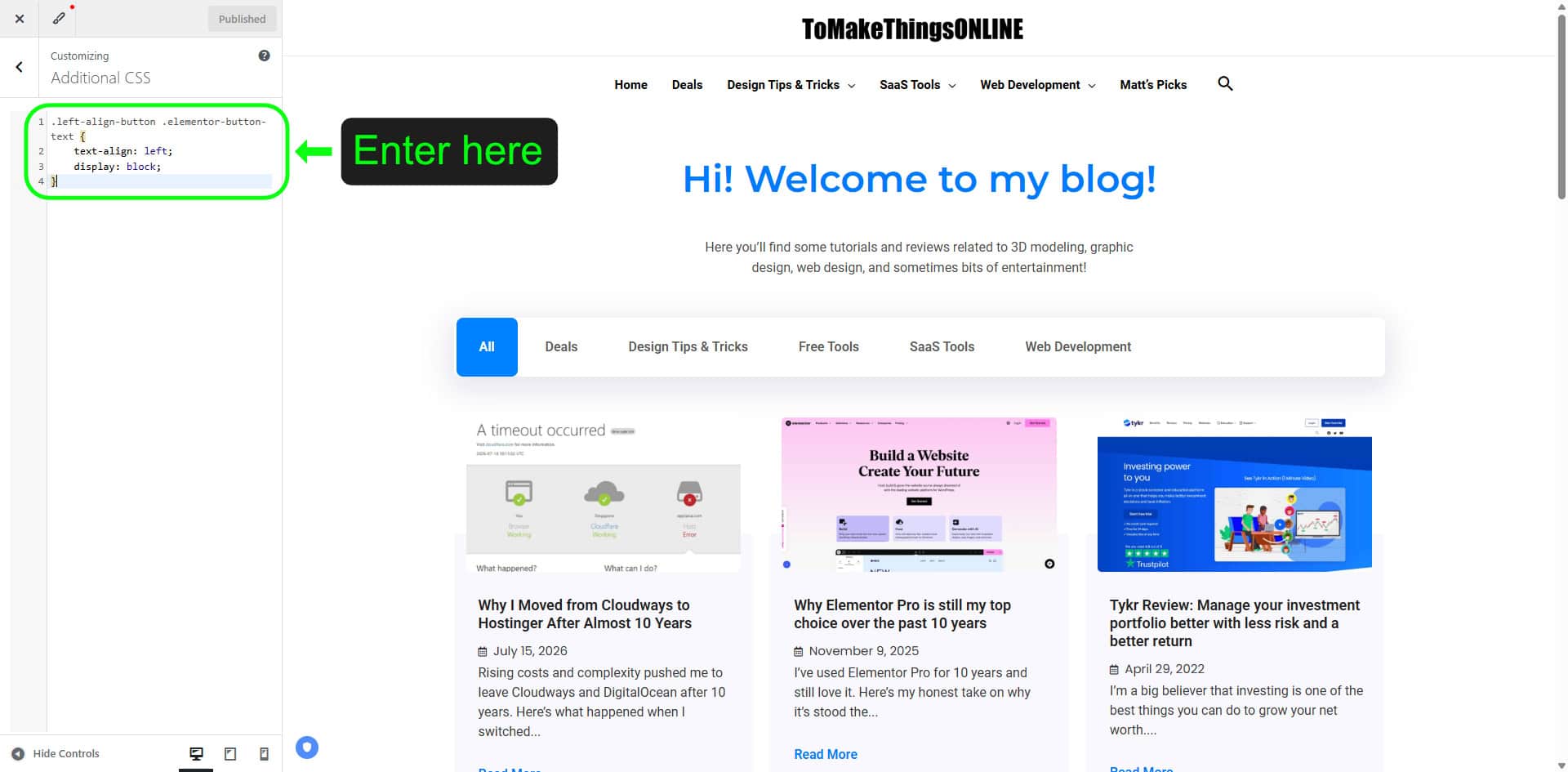
This works well if you only want to apply the styling to selected buttons.
A small tip before you publish
After applying the CSS, test the button on desktop, tablet, and mobile. Since this issue often shows up when the container is smaller, it is worth checking how the text wraps across different screen sizes.
Sometimes the alignment looks fine on desktop but becomes more obvious on tablet or mobile. If needed, adjust the button padding or width slightly.
Final thoughts
This is one of those small Elementor details that many people do not notice right away because most button text is short. But when the CTA text becomes longer and wraps onto a second line inside a narrow space, the default centered alignment can look a bit awkward.
If that happens, a small CSS tweak is usually enough to clean it up and make the button text look more natural on the page.
If you’ve found these Elementor tips useful, you’ll love what Elementor Pro has to offer. Explore advanced widgets, theme building, dynamic content, and more.
See all the features here → My Elementor Pro / One Affiliate Link
Common FAQs
You can left align button text in Elementor by adding custom CSS to the button widget. This is useful when long button text wraps onto a second line and the default centered alignment looks off.
Elementor centers button text by default. Most of the time this looks fine, especially for short CTA text, so the issue often goes unnoticed.
Yes, you can still do it without Elementor Pro by adding a custom CSS class to the button and placing the CSS in Appearance > Customize > Additional CSS in WordPress.
It can change how the button looks on smaller screens, so it is a good idea to test it on desktop, tablet, and mobile after adding the CSS.
Not necessarily. Centered text still works well for short buttons. Left alignment is usually more helpful when the button text is longer and wraps onto two lines.