Raise your hand if you are you a WordPress Designer or Developer! Choosing the Theme to work on for web design project was very much time-consuming in the past until the appearance of page builders such as WPBakery, Elementor, Beaver, Visual Composer etc.
And honestly, I’m tired of the search for a suitable Theme and crack my head figuring out how it works. I will love to stick to 1 powerful theme for all projects if possible.
Several results appear in the google search; multipurpose and light weighted for my upcoming projects. The top 3 that appeared the most are:
1. Astra Theme, US$59 per year, unlimited websites.
*I purchased the lifetime Agency Bundle directly from their website.
2. Neve Theme, offer US$59 (US$118) per year, unlimited websites for Business plan.
*I purchased the lifetime Business Plan from Appsumo.
3. OceanWP Theme (I’m skipping this because it’s too pricey.)
I purchased both Astra and Neve to try them out for a single project. And both are impressive for its pro modules and compatibility with Elementor, but it didn’t take long for me to decide on sticking with former one.

Why?
Neve is missing out several essential design elements for Woocomerce and header, footer settings. The alignment for the responsive menu isn’t intuitive, as it claims too. On top of that, Astra provides more design options with its Elementor add-on – Ultimate Addons For Elementor and premium starter templates. Continue reading for more details:
1. Cart Icon Option
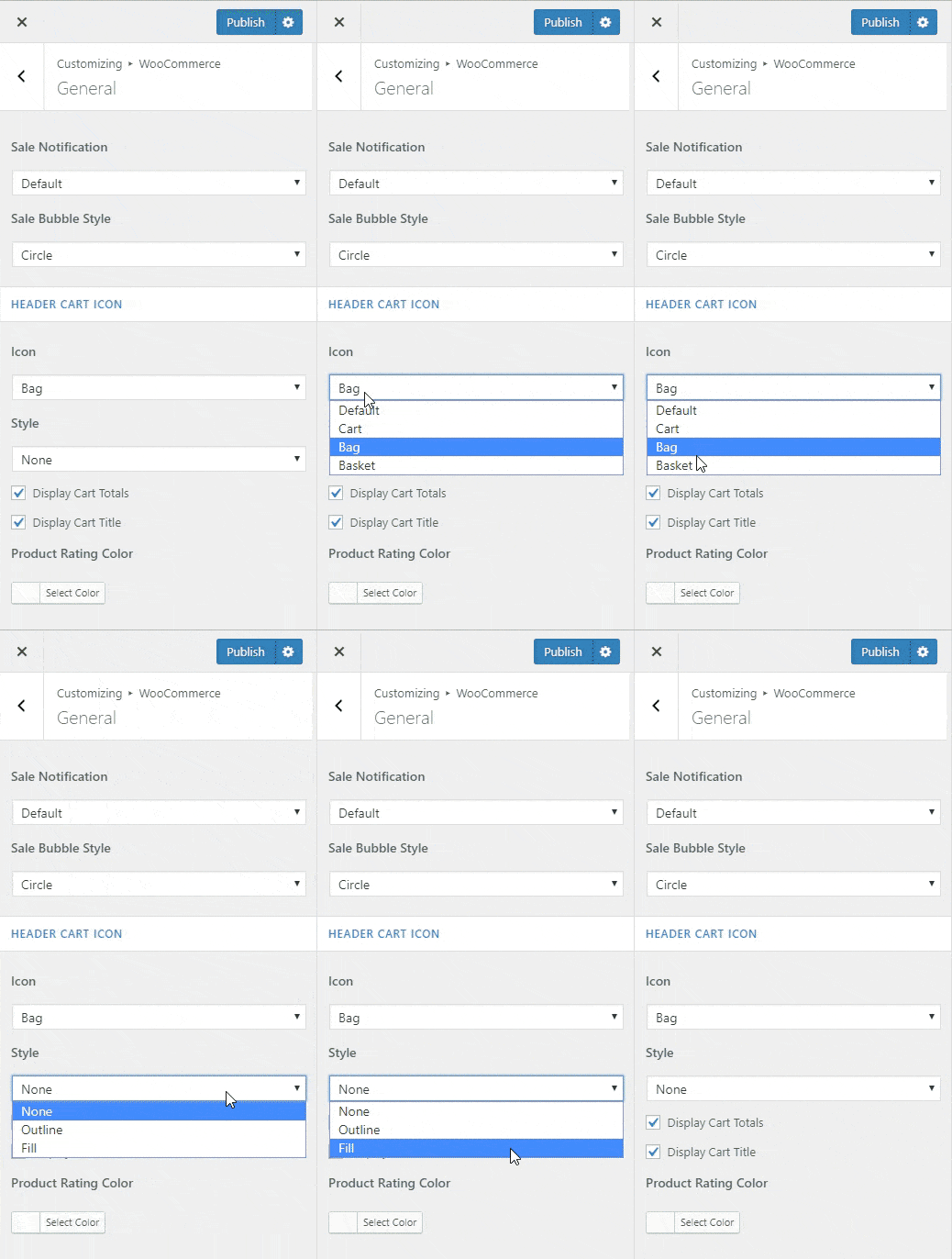
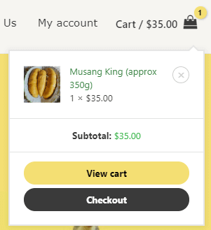
There’s no way to change the look of the entire shopping cart in Neve at the moment. Astra offers:
- 6 cart icons to choose from
- customize cart menu buttons: colors, button radius
- toggle display of cart total quantity & value
2. Display Out of Stock Status
It’s important to clearly state that your product is sold out in the product listing and description. And this is not available in Neve Theme.

3. Custom Layout
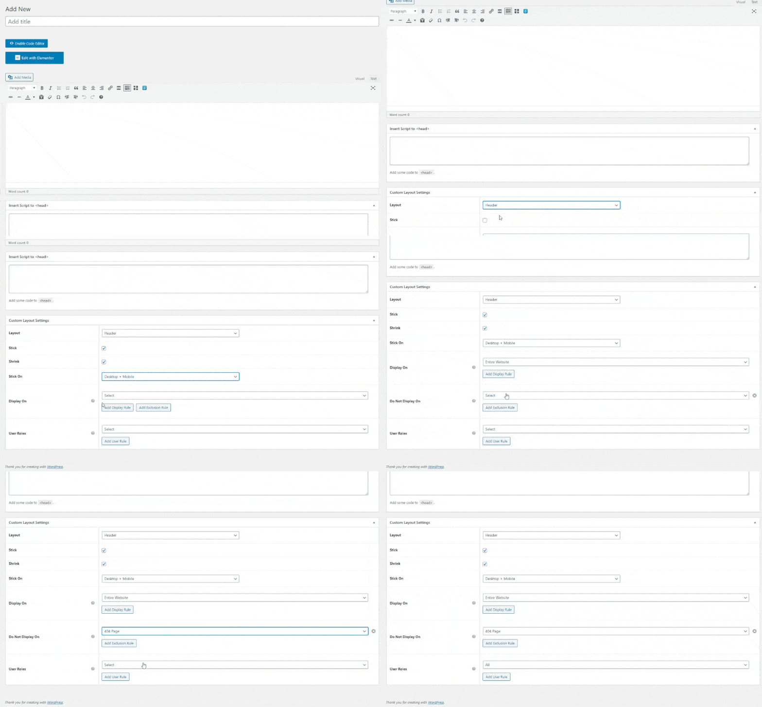
I was blown away by this feature while reading Astra‘s documentation. Typical themes limit the design to 3~5 pre-set headers and footers layout via widgets and customizer. Hence you may notice most websites contain a footer with 2~5 columns and plain background.
Astra not only offers similar options in the customizer, their Custom Layout feature also allows designers to fully customize the website’s navigation with code editor and page builder! It overwrites the header and/or footer settings. No coding, no additional plugin, no limitations!
What can I do with it?
All in all, with the combination of functions available, designers can use this function to create a very personalized user experience for different devices and users type.
They are also handy if you wish to present a different navigation layout to the client on different pages. Here’s a breakdown of the key functions in Custom Layout:
1. Custom Header and Footer
As stated earlier, you can design it with your favorite page builder.
2. Custom 404 page
This is something that I’ve not tried out so far. But at least I know where to change the default 404 page included in the Theme. Lol
3. Custom Layout – Hooks
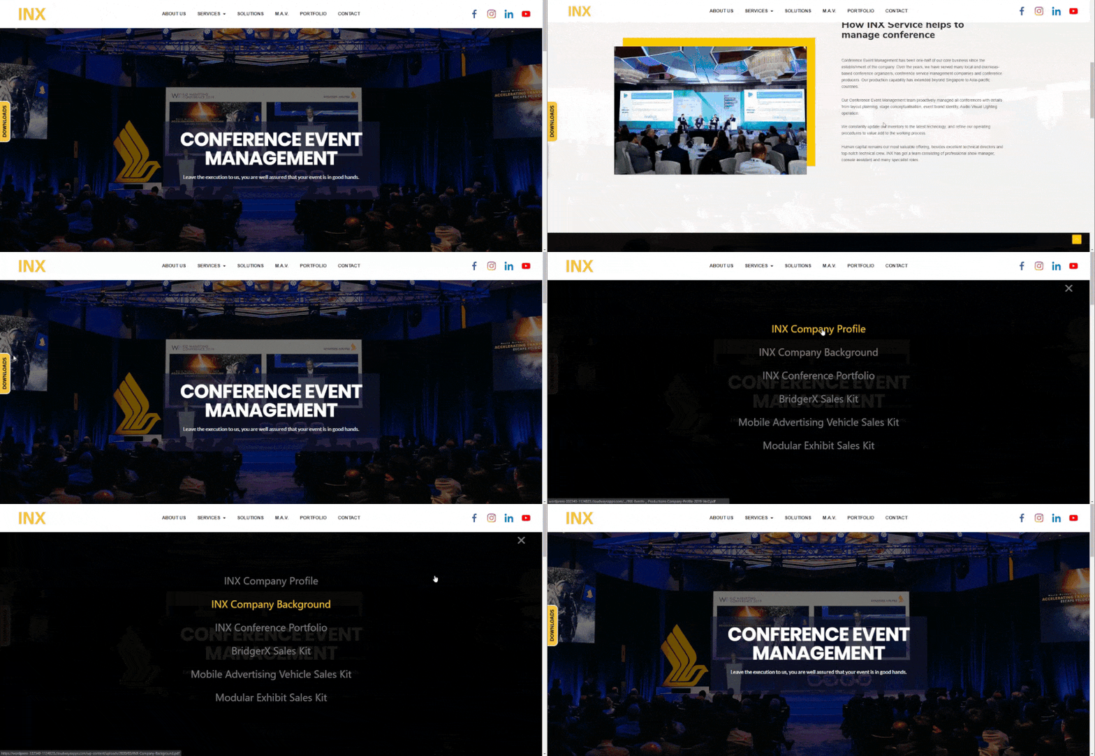
This function allows you to inject custom code or content into various action hooks easily. It can be used for Pop-Ups, so far I’ve been using this function for injecting sticky side bar coding. The only limit is your creativity + coding skills! (•̀o•́)ง
The following is an example of what i made for my client, a sticky “Download” button with modal popup overlay.
4. Responsive sticky and shrink effect
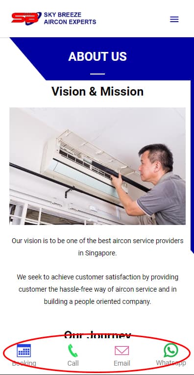
Stick on features works excellently together with its display conditions. You can specifically stick on Desktop/Mobile devices only or both. For example, sticky contact menu that only appears on mobile devices. But it’s not perfect as I can’t separate tablet and the mobile view from the “mobile” setting.
5. Display Conditions
This function allows you to set a different look for:
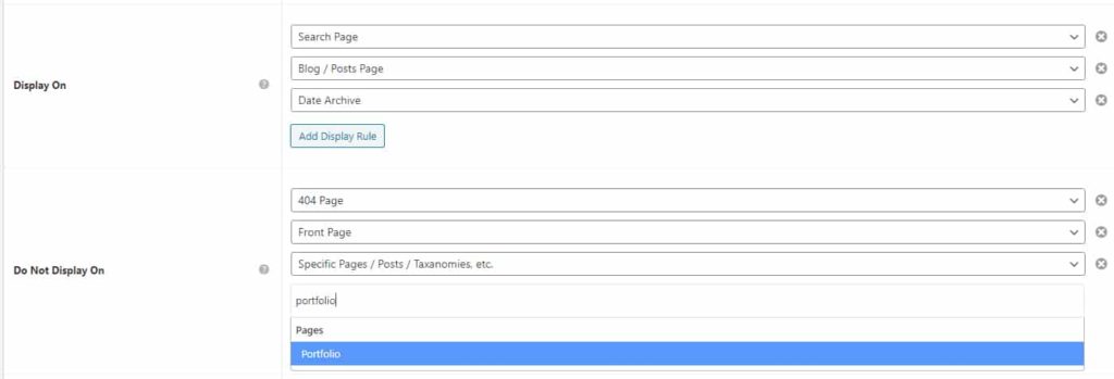
a. Entire / selected page with exclusion rule.
You can easily enable/disable the layout on multiple pages by using their drop-down functions. All the standard options are available by default; a search function is available to look for a specific post/page. Hats off to the developer for creating such a thorough feature!
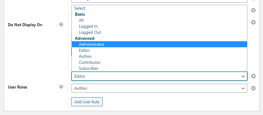
b. User Type
I think this function is beneficial for subscription type websites. I’ve not tested this function so far, and I wonder if it works with other membership plugins. I Will update on this if I ever met a client who has such a request.
Doesn't Neve has Custom Layout too?
Yes, Neve does have similar features; the differences are:
1. No Stick On function
Personally, this is the deal-breaker for the conditional display option. But this can be resolved by injecting CSS code.
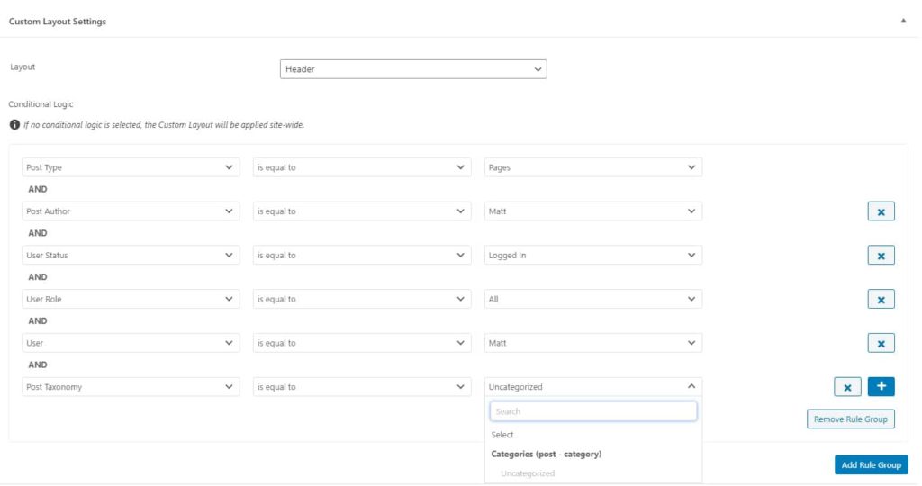
2. Display Conditions
Neve actually did a better job on this. The interface is very different from Astra, and with more options.
a. User – you can select an individual user.
b. Post Author – this is good for news pages with multiple authors. E.g., Header for a short introduction, footer for signature, or related post.
4. Elementor Addons
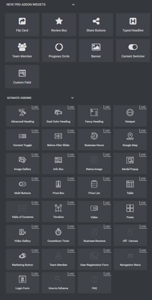
Neve provides the Addons as a built-in module, while Astra bundled Ultimate Addons For Elementor plugin in its Mini Agency Plan which provides 31 design widgets for Elementor page builder. The difference is obvious, isn’t it?
5. Starter Templates
Both themes offer several sets of design templates to speed up the design progress.
If you’re looking for trendy design or inspiration, I will strongly recommend Astra Theme. Their starter site has more variation in terms of style, and the development team really put in a lot of hard work to create beautiful, functional templates.
In fact I learnt alot from the templates by understanding how each of their sections is created.
With over 100+ templates and continuously adding more, Astra also neatly organized everything with a search function. You can sort them by:
a. Page Builder – Elementor, Beaver Builder, Gutenberg, or Brizy
b. Category – Blog, Business, Ecommerce, or others
c. A search function to look for the design via keywords
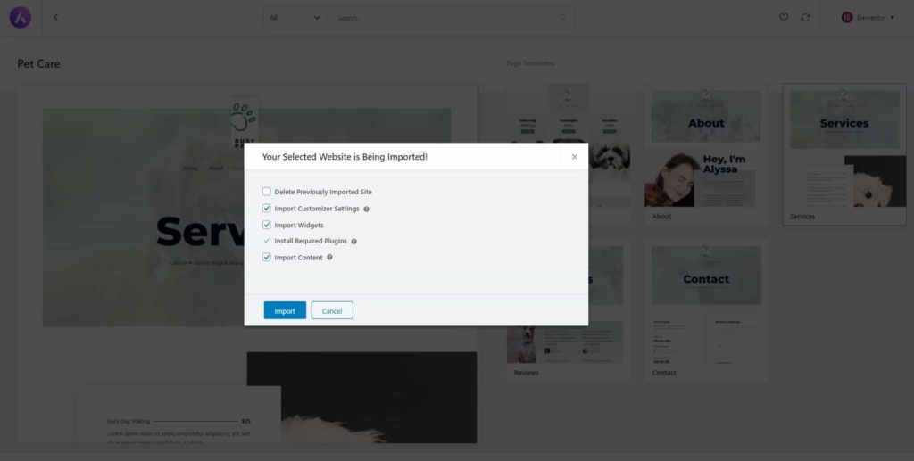
Importing template is a breeze with Astra Theme too! You have the option to import the entire page or individual page, with the option to delete the previously imported page before confirmation.
WOW, I try not to import the demo site in the past because it can be quite tedious to remove the imported content from other themes.
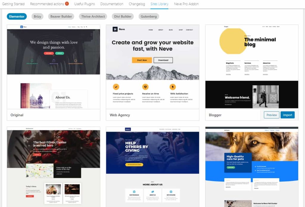
Neve offers very generic design templates that are rather common or easy to make; it’s usable if you’re looking for a plain, minimalist design. The downside is it only has the option to import the entire website, and no option is given to delete previously imported content.
Finally this review has come to an end! So happy that I picked up time to finish this, hope the information helps you in deciding which Theme to go for.
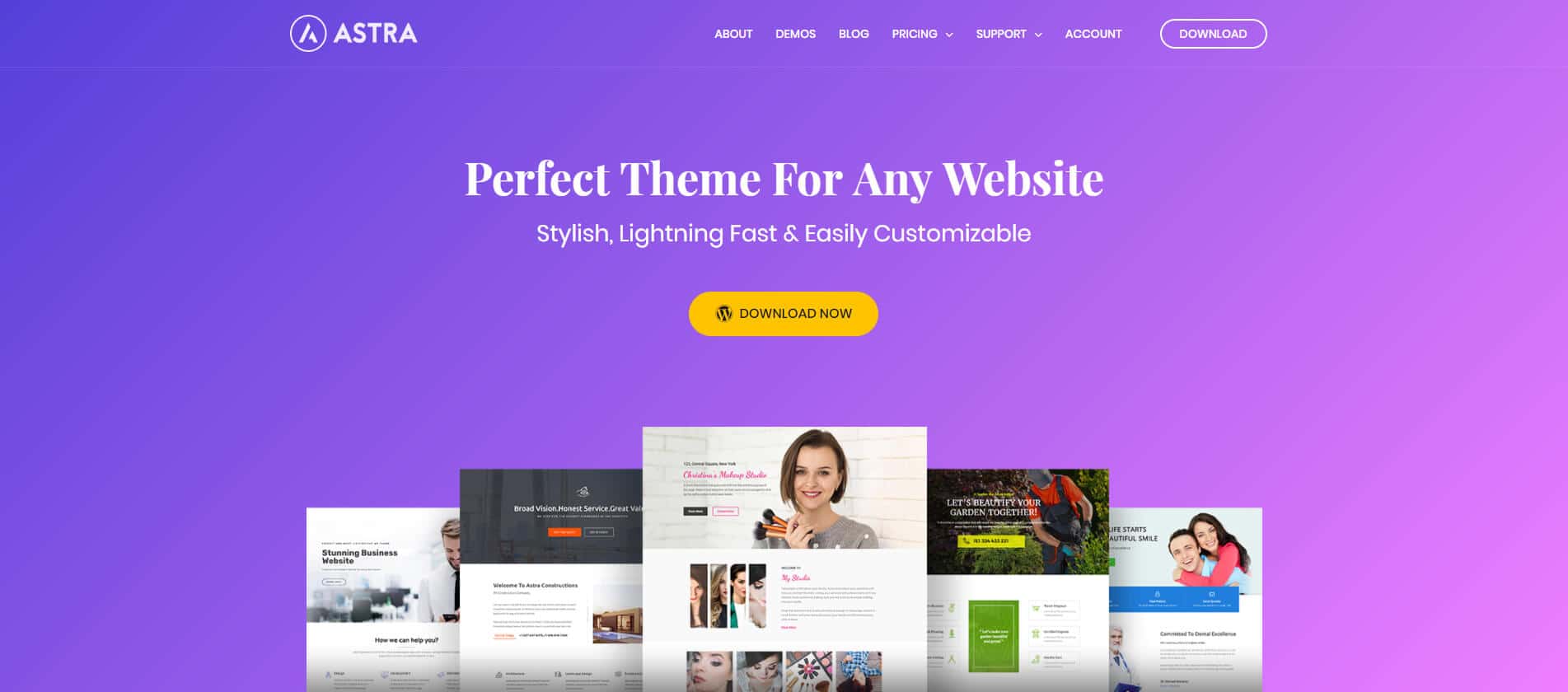
You can purchase Astra Theme by clicking the image link below:
Thanks for reading!
*Last update: March 15, 2020.



6 thoughts on “Why I chose Astra Theme over Neve Theme”
Good article so far, mate. I’ve been using the Genesis framework for almost two years and decided to switch to either Astra or Neve. Was already tending to go with Astra but now I’m sure it’s the right decision. Hope you’ll finish the article soon.
Haha, thanks man! Shall try to find time to work on this. It probably will take about a week to share more of the key features Astra offers.
Why don’t you have a publish date on this post? Themes are updated regularly so I can’t tell if this is relevant. Did you post this 5 years ago or 5 months ago?
Hi Kevin, I completed this post on March 15, 2020. You can find the publish date below the post title, it isn’t obvious with the current banner though. I’ve added the date at the bottom of the article. Thanks for highlighting! Cheers
what astra theme are you using to run your website
Hi Godswill, I’m using Astra theme on this website. If you’re asking which starter template am I using -> This blog is made from scratch with Elementor.